Hatch Show Print: Type High Takes Time from Country Music Hall of Fame on Vimeo.
To successfully letterpress print a form, or arrangement of type and imagery or graphic elements, every letter, character, and block needs to be the same height, so the inking rollers apply an even layer of thin ink to the faces of all that should print, and the ink can then be transferred well to the paper that is pressed into the inked arrangement.
In America, the type and presses we use are made for type height to be .918 of an inch. The two best explanations thus far for this seemingly arbitrary yet very specific value are:
- The height of a British shilling placed on edge is .918 of an inch
- ‘. . . Then the American Point System was devised and agreed upon in 1886 by the United States Type Founders’ Association. Eighty-three picas became equal to thirty-five centimeters, then dividing the pica into twelve equal parts, (points). Thirty-five centimeters then also became a standard for type-high (height-to-paper). By this plan fifteen type-heights (.918) were made to equal thirty-five centimeters.’
– Theodore Low De Vinne’s (c) 1899, Plain Printing Types, Oswald Publishing Co., New York, 1914.
Throughout the shop’s history, up until the mid-1970s, periodically replenishing the supply of printable type, both in wood and metal, was part of the day-to-day operation of the business. When the manufacturers of type went out of business, the shop carried on using what type the shop had. Over the last four decades or so, the type has gradually become worn and distressed from use.* That means that it requires more makeready, or bumping up, to ensure that each letter block of type or imagery prints as well as it can. Too much makeready, though, and we risk damaging the block further, so it’s a careful process. And sometimes, a printer will need to adjust a hand-carved block, to ensure that it prints well, too.
In the video, Heather and Dan are printing a run of posters on our Miehle 29 from 1946. Heather is using makeready to increase the height of certain letters or hand-carved image blocks to make sure the type and images show up clearly and as crisply as possible on the poster.
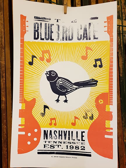
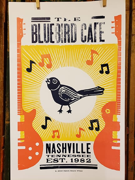
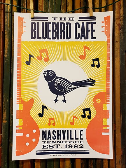
The proof is in the print – these photos of three different prints show the progression of makeready Heather had to do to get to the final print, while she was running the final color of the poster, the dark blue:
In the first print, it’s easy to see that a lot of the type needs help, and that while the bird is printing really well, most of the music notes are a bit light.
And, if you can see between the linocut bird’s toes, and on the left edge of the guitar on the right side of the poster, there is a bit of ‘chatter,’ where stray bits of linoleum have not been completely cleared away from the block. Eventually, those bits will need to be cleared away.
As long as the press is operating properly, the degree to which something is not printing is related to how much makeready it needs; for instance, the ‘T’ in THE at the top of the poster does not need much help, but the ‘H’ is practically non-existent. So, Heather might have put a piece of copy paper underneath the ‘T,’ but something thicker, such as a piece of 80 pound cover (the thickness of most posters we print), or even a piece of packing paper, will go under the ‘H.’
Because the type is all locked up in a chase for our Miehle runs, every time Heather adds a piece of makeready underneath the blocks, the chase is opened, so the blocks that do not have makeready on them can settle down around those that have had makready added to them, and each block is standing on its foot in the press bed. Then the chase is tightened up again before printing.
Some makeready was added between the first and second prints, so now the type at the bottom of the poster looks pretty good, but some of the letters (and the rule) in The Bluebird Café are still not printing well, and the blue music note on the lower-right of the poster still prints a bit light.
So, back to the pile of paper of varying weights/thicknesses Heather goes, to select the right one to use, cut to the size of the block, and then apply it underneath the block in the press bed.
Finally, by the third print, the type and graphic elements are printing solidly as is possible, and consistently. And, you can see that the chatter between the bird’s toes has been eliminated. Now, the poster is ready to be put under the scrutiny of proofing. Once all of the spelling is checked by three proofers, the posters can be printed.
* We are happy to report that there are multiple type makers, cutting ink-worthy wood type again, in the twenty-first century. A number of our videos have featured Scott Moore of Moore Wood Type; Virgin Wood Type operates out of New York; and Hamilton Wood Type and Printing Museum has a library of patterns that the company used in the last century to cut type from, and they have actually used it in this century to make type for our shop, to replace a font of type that was lost. This is the topic of a future blog post and video!


