With 137 years under our belts, we’re often carrying on traditions and routines that were established by the Hatch family in its first two generations, albeit with a few twenty-first century twists. Being thrifty and resourceful has always made sound business sense, and helps to ensure that the presses keep running. Today, thrift and resourcefulness are responsible stewardship, not only for the shop, but for the community we’ve been fortunate enough to call home for nearly a century and a half.
Reduce, also known as Christmas Miracles.
If the founders, Charles and Herbert Hatch, or Charles’s son, Will T., were to walk into the shop today, they would feel as if time had stopped. Almost. Each of the seven designer-printers on staff can carry out all of the different tasks required to get a job from the order queue into a client’s hands, including designing the poster, printing the poster, trimming and packing the poster, and, in between, maintaining the presses, and carving new imagery as needed to complete a design.
However, we no longer can call our wood-type manufacturer to order 26 x 40 inch slabs of type high wood, prepared to be carved and printed immediately, so we must be a bit more resourceful. (The few type cutters manufacturing type today are focused on preparing the hard woods necessary to make sturdy type.) Fortunately, good friends of the shop happen to run an interior construction business and finishing shop, and instead of throwing away the yards of wood scraps left over from their projects, they give them to us, and we use them to create image blocks. We either glue linoleum to the wood and carve the linoleum, or carve into the wood itself. When it’s time to print, we have to build it up so that it is type high in the press bed, and away we go. While these scraps are too small, or oddly shaped, to be suitable for the work our friends do, they are more than big enough for the blocks we need to carve. And, they never see a dumpster.
Our trusty Ben Franklin saw helps trim down the wood to the correct size for a carving, and we keep a huge box of the scrap wood nearby, for smaller images, and, as needed, to carve a replacement letter for a font.
Reuse, also known as Yogurt Cup Specials.
Hatch Show Print is widely recognized for its minimal use of negative space. Vibrant colors, well matched with complementary colors, printed nearly edge to edge, make for eye-catching posters. We mix all of our ink using a set of basic colors, including three blues, three reds, yellow, black, and white. Once in a while, we’ll add green to that lineup. Each print job calls for hand mixing these basic inks into the colors you see on our posters. Printing hundreds of posters a year really hones our color sensibilities, and sometimes a client likes us to use the colors of their brand. We mix a lot of ink by hand.
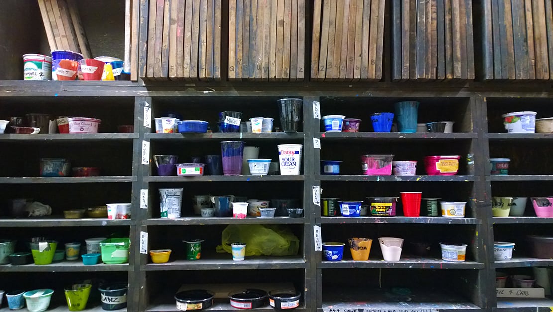
When the quantity of ink we mix is more than what’s needed to print that run on the posters, we save the leftover ink. A set of shelves in the back of the shop are full of yogurt cups, deli salad containers, party cups, pretty much any plastic vessel that is not too awkward to hold and store the leftover ink. And, this treasure trove of ink is a wonderful place to start when it comes to preparing ink for a future poster . . . Sometimes there’s just enough ink to help finish out a new print for the retail store, or, like the sourdough starter bakers keep in their kitchens, the ink from one of these cups can be the base for a fresh batch of ink to be mixed. Either way, there’s no need to toss out good, useable ink, particularly when there are containers that we can reuse to store it.

Saved ink, in reused containers, provides inspiration for future ink mixing.
Recycle, also known as Accidental Art.
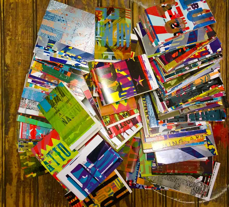
When preparing each layer of a poster’s typeset words and images for its print run, we have to spend time making sure each piece of type is printing well, and that all the type is in the right place for the overall design. As we progress through this process, called makeready (short for making ready to print), the details include checking the registration with the proof of the overall design, and carefully ‘bumping up’ type that is a tiny bit too low, with something as thin as a piece of scotch tape or copy paper. Each time something is adjusted, a piece of paper needs to be printed, to verify that it worked. As a designer-printer progresses through makeready, a number of prints may be required to pass through the press. Instead of just tossing out these “almost-but-not-quite-good-enough” prints, we hold onto them and use them a few more times when making ready on other jobs. Layering miscellaneous type and imagery on top of each other creates beautiful results, and we cannot just throw them away. We chop them up, to make postcards, and hand-sewn, pocket-size journals to sell in our retail shop. It’s impossible to keep our eyes and hands off of these brilliant bits of multicolored paper.

