Fly In the Ink, A sporadic series of scribblings from the print shop
Many of the posters and prints that we make require one, two, or three colors to achieve a complete design. When a poster calls for a little or a lot more color, we have ways of getting the ink on the paper without requiring more time on the press— we just apply multiple colors at a time, sometimes using additional tools and accessories our printing predecessors developed decades ago. There seem to be as many ways to do it as there are color combinations!
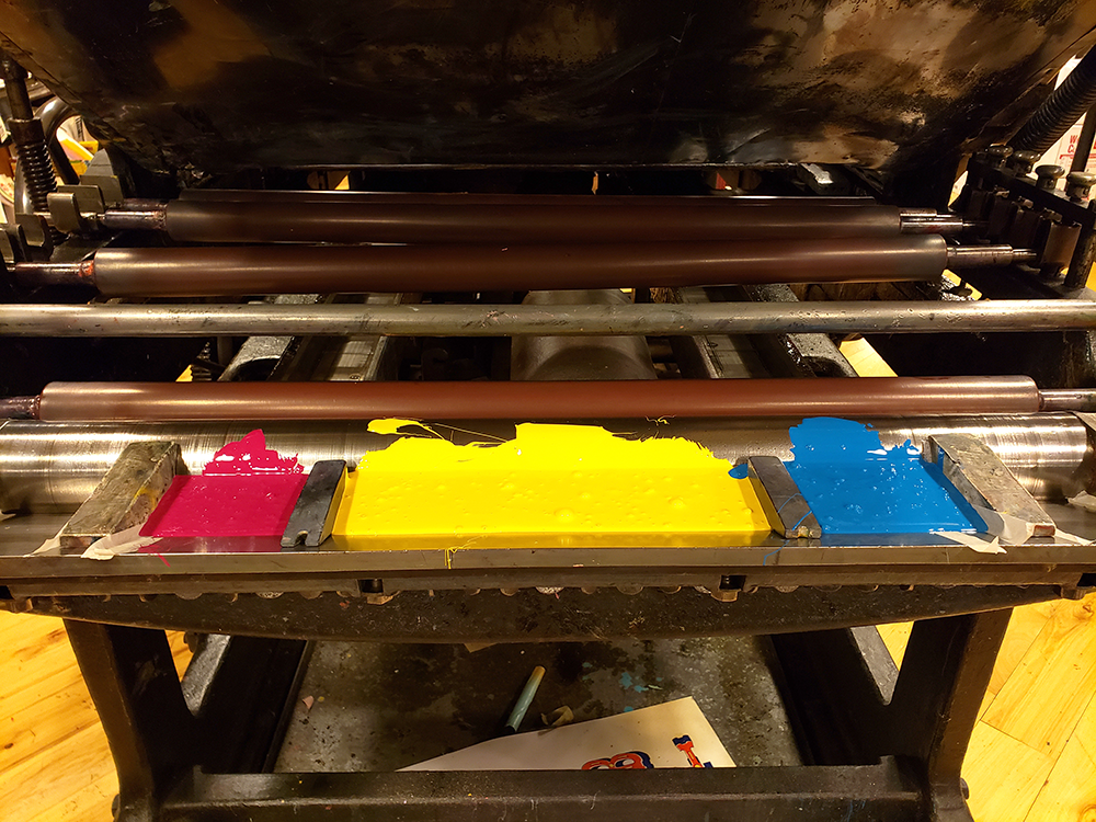
Split Fountain. If you print on a large press or a press that has its own ink distribution feature called a fountain, you can divide the part of the fountain where the ink is applied in order to keep the colors separate from one another before being distributed throughout the inking rollers. Wedges are hunky pieces of metal (or in the case of our Miehle Pony, 3-D printed hunky pieces of plastic from our friends at Tribune Showprint used alongside the metal wedges) that are shaped for nestling right up against the ink ductor roller while seated in the ink trough of the fountain.
The fountain—full of ink with two wedges separating the red, yellow, and blue— looks like this (since our Pony is quite old, the wedges on the left of the red and right of the blue are in place to limit the ink flow to areas of the press where nothing is being printed):
And you can see the printing action in this video:
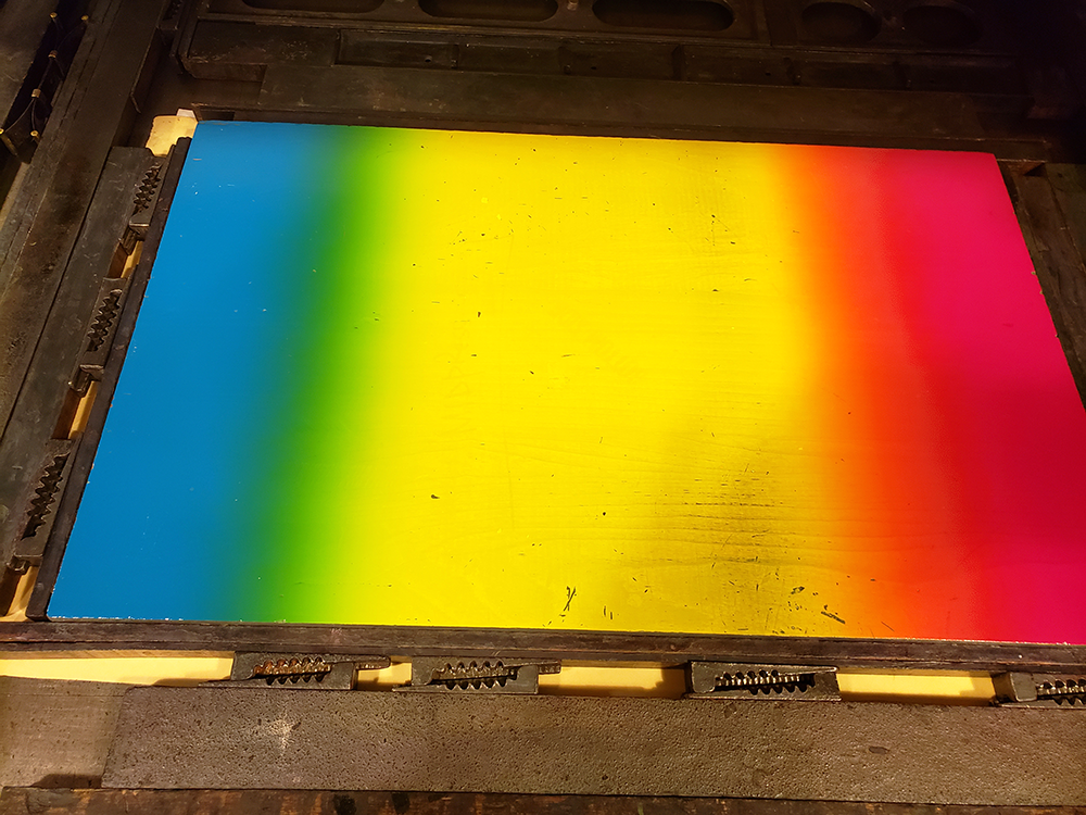
Because one of the form-inking rollers oscillates, there is a bit of blending that happens between each color. But using the wedges to create the split fountain maintains defined areas for each color in the print. For example, if the wedges were not in place here, it is likely that the red and blue would eventually overpower the yellow and the middle of the print would become a muddy blend of green and orange.
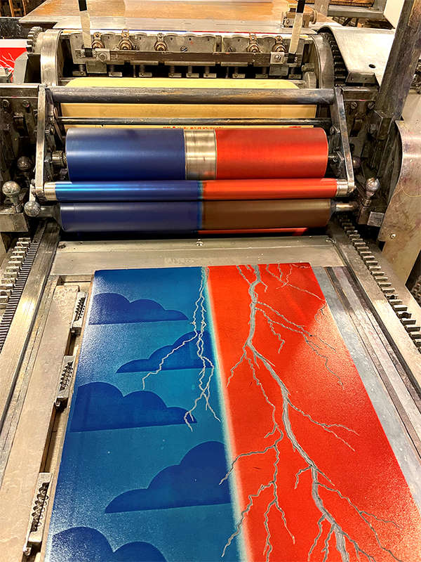
Split Roller. For designs that call for two distinct colors to be printed at once, two of the Vandercook presses we use in the shop can be set up with one or two rollers in the ink-distribution arrangement that have channels cut out of their surfaces. These channels help ensure that the rollers do not distribute ink all the way across the form rollers. The width of the channel is just wide enough to keep the two different inks from blending with one another.
In this photo, you can see red and blue ink on the press at the same time,
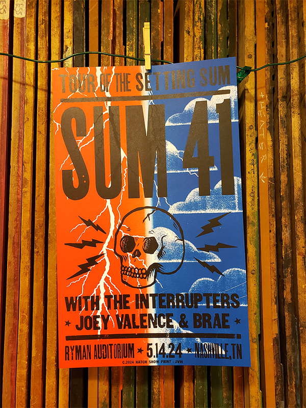
And the completed poster has vibrant red and blue ink with no blending in the middle.
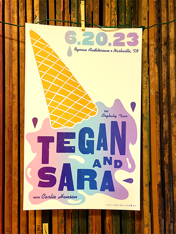
Rainbow Roll. When it’s okay if the colors blend a little or a lot, we apply ink without any gadgets that keep them separated. A rainbow roll is the catch-all term we use for anything that has multiple colors that may make even more colors, such as the pink, blue, and purple in this poster for Tegan and Sara.
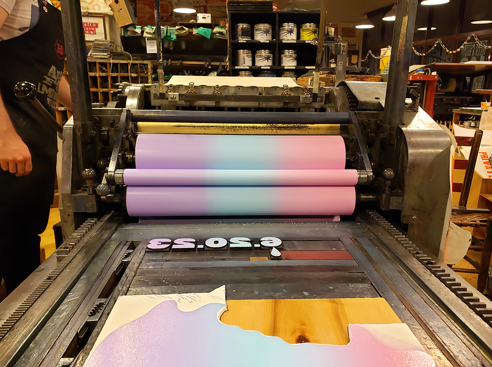
It’s quite subtle in the final print, but you may detect that the text on top of the ice cream seems to change color from left to right . . . that is a gradient.
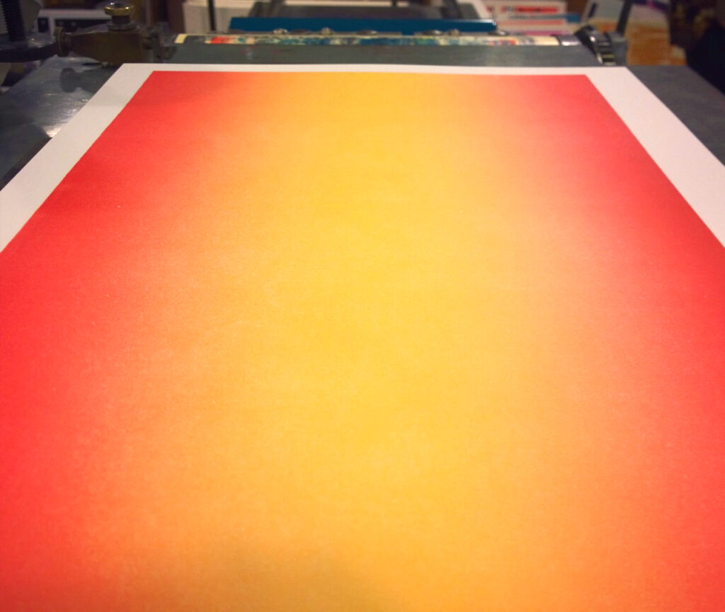
Gradient. This is the simplest of approaches. The color scheme focuses on the gradient shift of one color with the addition of another color. It can be subtle or dramatic, as in this background gradient of dark orange to light orange to dark orange.
How does your rainbow roll? Do you have a different name for it? We’d love to hear about it or see photos—tag us on Instagram so we can see what inky adventures you’re up to!
*The form is the arrangement of type and/or printing blocks that have been locked into the press to be printed.