This summer, I made a trip to Italy, to study some of the origins of the written word, and the printed word (in the Western Hemisphere), and then do a little bit of printmaking myself. Traveling is a great reminder of how wide and wonderful the world is, and how many fellow printers there are out there.
I’ll try not to wander too far off the path of this tale, but tracing the connections from pre-printed words, on stone and in books, into our world here at Hatch Show Print, is fascinating. From a time in the fourteenth and fifteenth centuries, when books took a long time to make, because they were written by hand, on vellum (paper was not widespread in Europe until around 1400), and most often were copied from another book, they were considered precious objects and very personal to any individual who could afford to pay what would have no doubt been a considerable amount to have the book made. In this era of the 140-character story, it’s not too difficult to imagine how deeply those books were treasured by their owners.
One of the details that I find so delightful is the origin of what we printers call manicules, printers fists, or more simply, pointers, because it is so obvious, and, in this era of selfies, it is just a reminder that we’re not so different from our distant, distant relatives as we might otherwise think. Like us, they, too, enjoyed finding a way to insert themselves into the world beyond their skin.
In this fifteenth century book, the owner has pointed out an important passage that should be read again and again.
And he’s used the image of a human hand with one finger extended, pointing to the passage of text! A human hand, drawn into the book by its owner. Wow!
This little tool has been adapted, for the design of printed matter: Many print shops have an array of manicules or printers fists, plus even more simplified arrows and pointers or swashes.
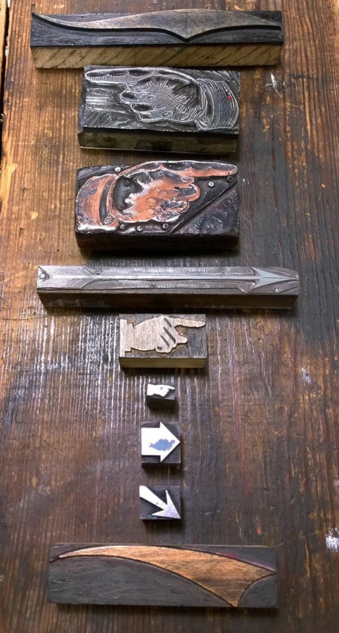
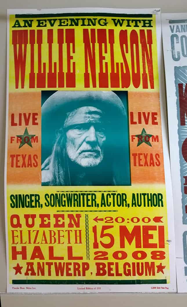
The word manicule has origins in Latin, manicula, for little hand. These guys are used to highlight or underscore the important pieces of information, such as the ticket prices on this Subdudes poster, or the arrow that surrounds the time on this Willie Nelson poster that also points to the show’s location.
Stay tuned for more typographic tales!